

Iterate + Expand
Merrill EDGE Stock Story for Mobile
Merrill EDGE
Project:
Mobile UX/UI for existing desktop platform.
Role:
UX Design Lead + Visual Designer
Stakeholders:
Merrill EDGE Business Team
End-User:
Merrill EDGE Investors of all investment knowledge.
Design Challenge:
Designed as a desktop experience, Merrill EDGE's "Stock Story" helps users of all knowledge levels make educated investment decisions. The project was de-scoped as a fully responsive site due to an aggressive launch timeline. After a last minute client request, both mobile and tablet features and functionality were included for the initial release.
As a late addition to the product team, I was brought on to assist in the definition and execution a fully responsive product. Working closely with our developers, we set out to design and restyle the existing front-end code. The main objective was to create a consistent product across all platforms, down to the smallest mobile breakpoint.
Whiteboard + Sketchbook


Process:
Working within an established agile team environment, we leveraged existing design patterns and HTML/CSS. From there, we determined which features and functionality were most appropriate for the mobile and tablet user. Once a feature analysis matrix was approved, we moved into wireframes for both mobile and tablet.
Our core focus was navigation and interactions specific to mobile devices. In order to convey the desired functionality, we built feature specific prototypes to review with the stake holders. This allowed us to make decisions swiftly and move into visual design ahead of schedule.
Wireframes


Solution:
While working with the Merrill Lynch Business team, we delivered a detailed feature analysis to better understand which features would be appropriate to the mobile user. Once features and functionality were determined, we began initial workflows and collaboration with our developers to understand the mobile interactions of the app. By documenting and communicating important mobile features across teams, we were able to quickly move through each stage of the project.
Visual Design


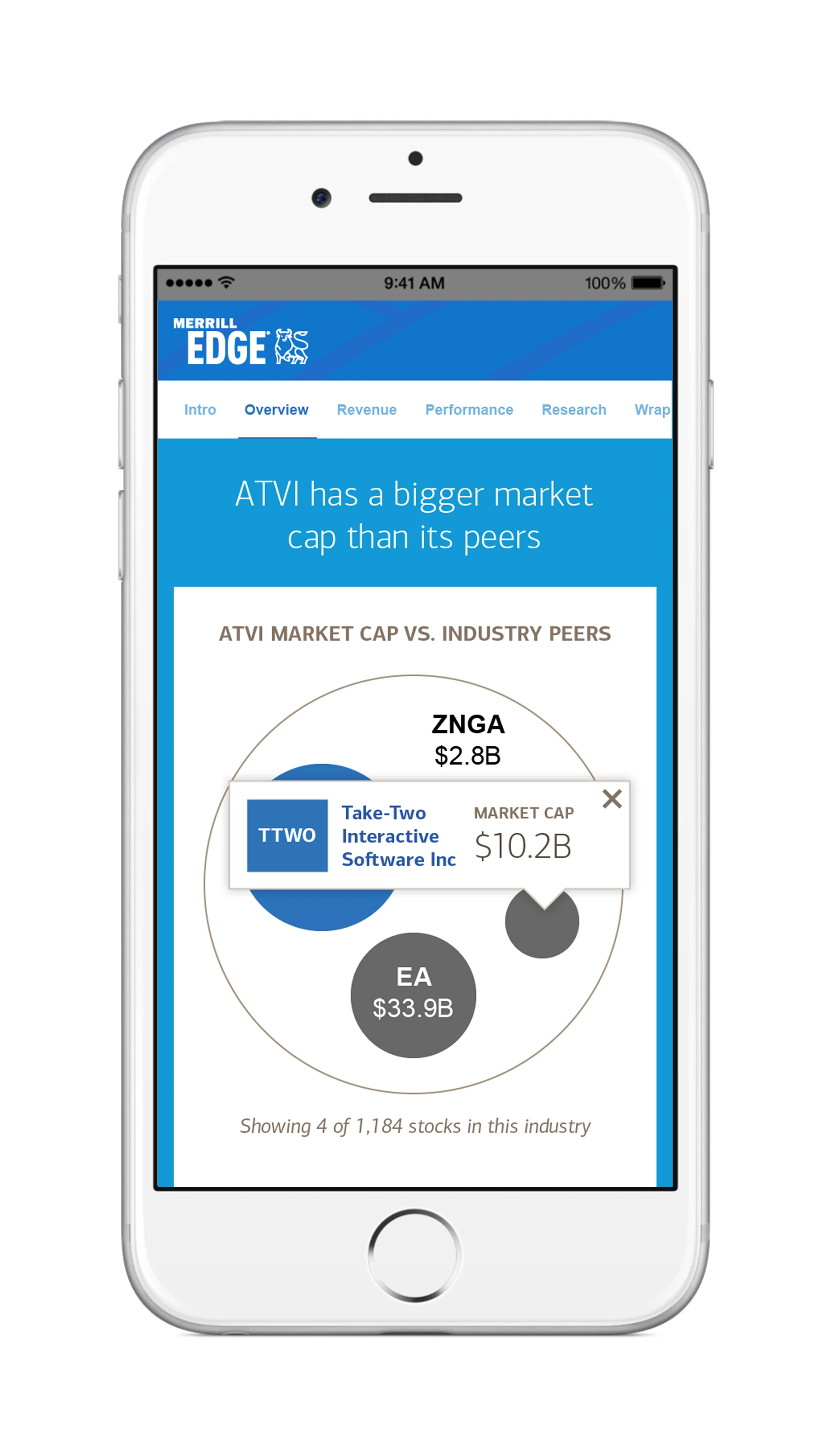


“Stock Story displays nicely on a smartphone, tablet, laptop, or desktop screen. The layout adapts to the device you’re using.”
Result:
Our team successfully created an all new CSS and pattern library for both tablet and mobile views. The end result was a fully featured and responsive product. Stock Story launched this Fall with the mobile, tablet and desktop user-experiences to favorable client and industry reviews.
Tools:
Adobe Illustrator
Adobe InDesign
Tumult Hype Pro
Artifacts:
Concept Presentations
Interactive Guided Demos
Final Responsive UI